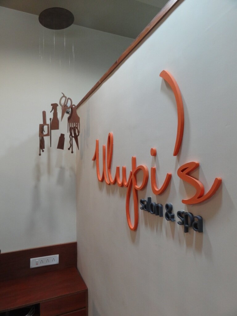
Ulupi Salon & Spa | Ahmedabad | 2012
Project Details
| Area |
75 Sq. Mt. | |||
| Client |
Mrs. Ulupi Parikh | |||
| Status |
Completed in 2012 |
Project Description
Ulupi’s salon was a lot smaller than our usual projects. It was clear that client was looking for something highly unusual. So we decided to take it up as our design challenge.
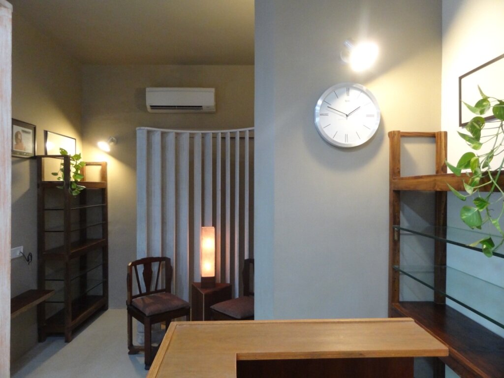
Based on the idea that such salons are all about pampering and beautification, we decided on a design concept of a shell to create a sense of soothing personal space in which clients would feel relaxed. This however was quite a challenge given the hard surfaces of mirrors and ceramic sinks as well as the limited space available once the barbers chair and massage couches had been accommodated. We achieved this by introducing open-work screens to create a sense of separate space without being visually obstructive as is often the case when trying to fit in many functions into a confined space. This effect is further enhanced by the use of light framed furniture (some of it old and beautiful), wooden finishes and muted colors throughout the interior.
This project is a good example of how a contemporary look does not have to translate into glossy hard surfaces but can be achieved with great efficiency through a well though out combination of old and new. The outcome was a pleasant and welcoming salon that pampered not just the body but also the mind.


